M Baas
I am a machine learning researcher at Camb.AI. I post about deep learning, electronics, and other things I find interesting.
Eskom Loadshedding - A 5 Year Trend
by Matthew Baas
A brief summary of the trends in Eskom loadshedding over the past 5 years.
TL;DR: it is sometimes hard to objectively convey whether loadshedding is improving or worsening in South Africa other than from individual experience. In this post I aim to give a few useful graphs and metrics which outline the trend in loadshedding over the past five years.
Data sources:
- Eskom’s data portal for national electricity demand and supply from the last five years.
- EskomSePush’s log of all loadshedding stages and dates from the last five years.
- This data goes up until the
2022-05-10, so I am excluding the effects of the recent (June/July 2022) Stage 6 bout supposedly due to industry strikes.
Updates:
- 7 July 2022: added an explanation for the sudden drop in consumer electirity demand in mid-2020 (i.e. government ban on economic activities).
- 28 December 2022: updated the first two graphs to include the 2022 up till the end of the year, now that it is available.
1. Loadshedding frequency
The first metrics I give are related to loadshedding frequency. I am not considering the frequency of actual power outage, as different municipalities can have substantially different amounts of power outages for different stages. So, I will restrict myself to the national loadshedding stage.
1.1 Average proportion of each day Eskom loadsheds
The most basic indication of the trends is simply the average fraction of each day that we are nationally in any loadshedding stage. This is computed by – for each year – taking the number of hours Eskom is in any loadshedding and dividing that by the number of hours so far elapsed in that year (which is the total number of hours in a year except for 2022, which is still ongoing). The result of this is the plot below, which shows us the average number of hours in each day that Eskom is implementing some stage of loadshedding.
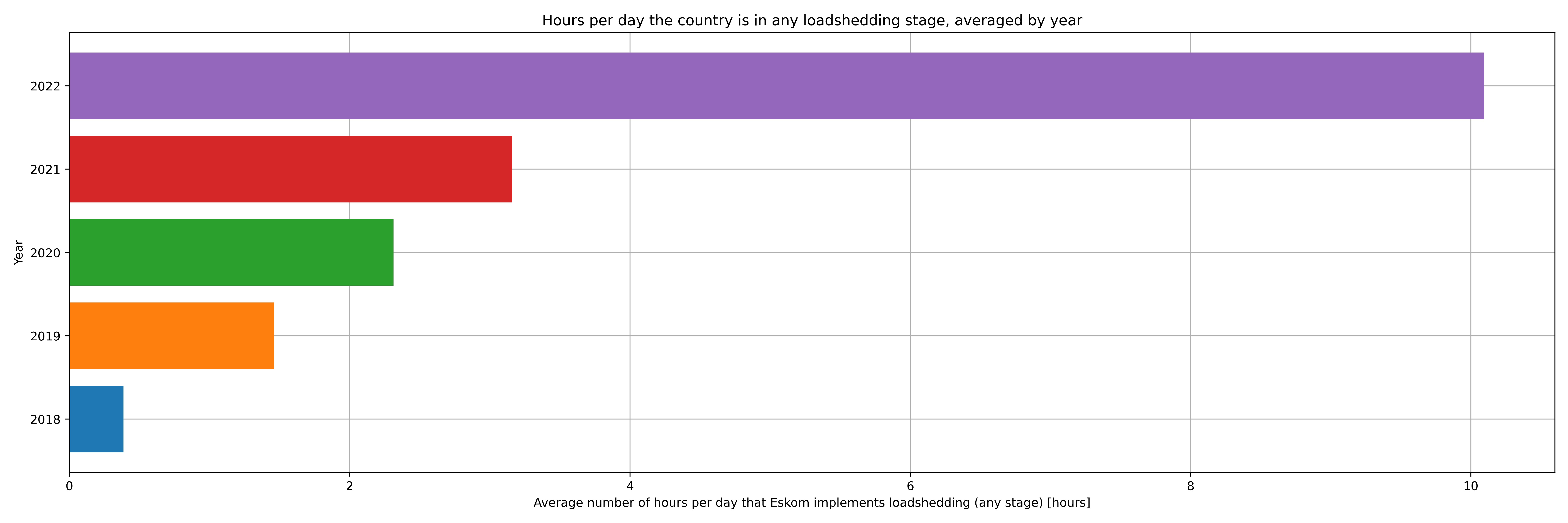
December 2022 update: the graph above now includes data up till 2022-12-28. The original graph is available here. As you can see, it has only become worse.
The trend is exceedingly clear:
Trend 1: SA citizens are experiencing loadshedding for an increasingly greater portion of each day, based on the averages for the last five years.
1.2 Average proportion of each day Eskom loadsheds in each stage
We can go further and give a breakdown of the average number of hours in each day that Eskom is implementing each particular stage of loadshedding:
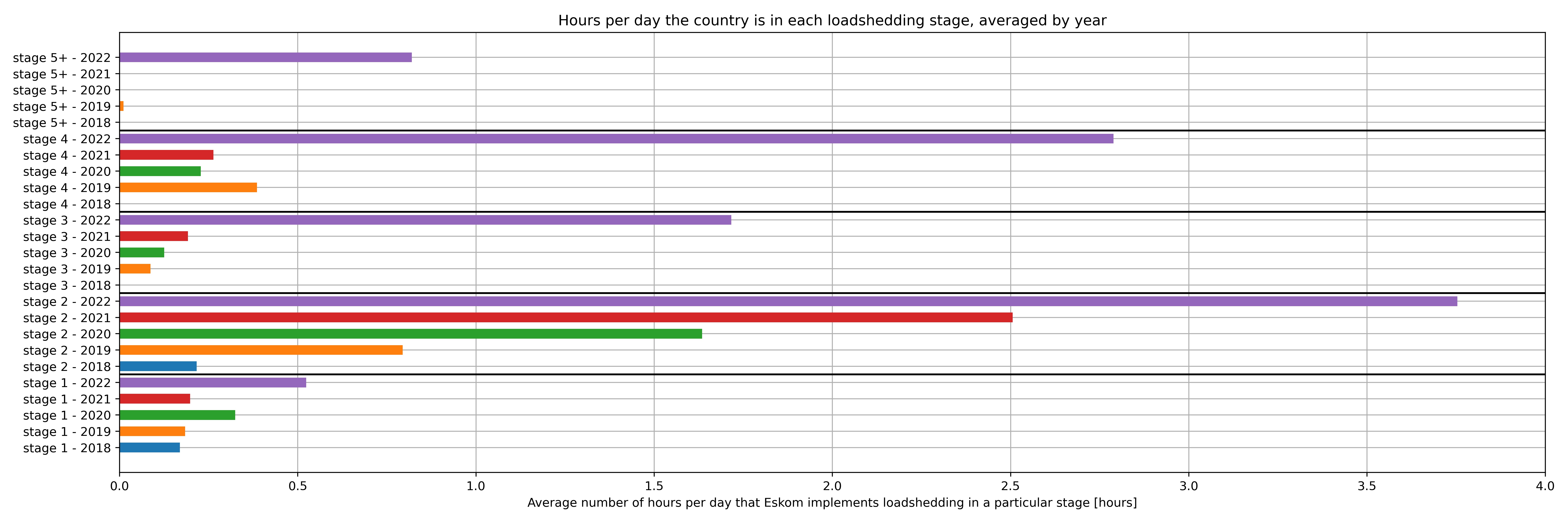
December 2022 update: the graph above now includes data up till 2022-12-28. The original graph is available here. As you can see, it has only become worse.
The trend is again clear – it appears that loadshedding frequency is increasing over the last five years. And note that if we would include the recent spate of stage 6 loadshedding in the last month or two, 2022’s stage 5+ bar above would dwarf the increased loadshedding in 2019.
2. Demand and supply
Eskom also provides hourly electricity demand by the country and its hourly available generation capacity, which is useful to answer a few more questions.
2.1 Electricity demand
Concretely, the next important question to answer is whether it is the government (i.e. Eskom) to blame or whether loadshedding is just due to the growing pains of massively increasing electricity demand. Luckily Eskom themselves provide the total electricity demand averaged per hour for the past five years. So we can simply plot the local electricity demand and answer this question:
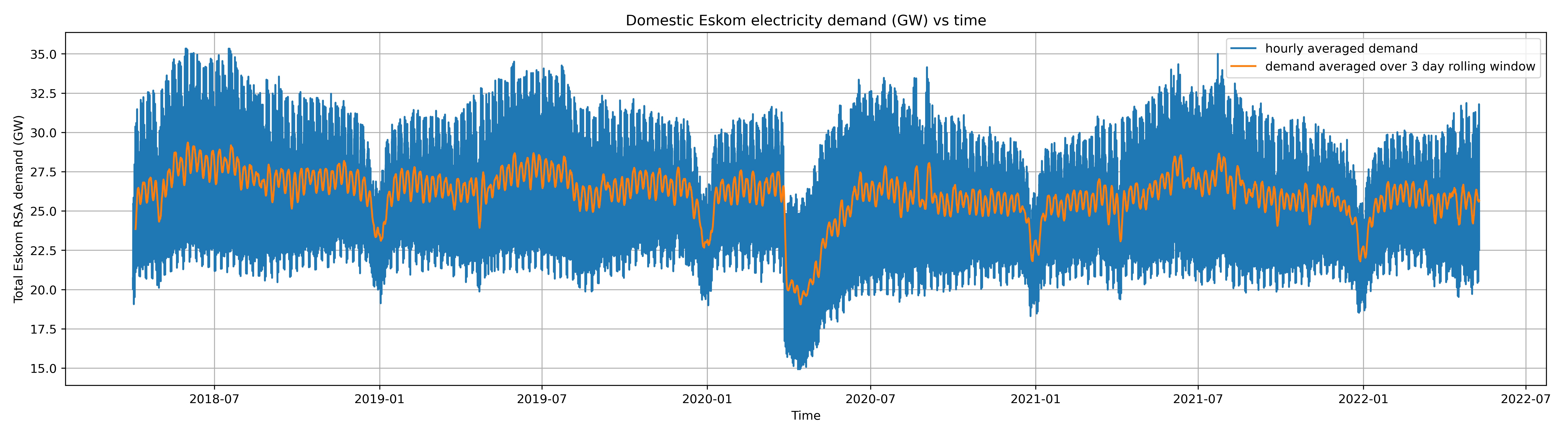
We can see that local electricity demand from Eskom has decidedly not been on any upwards trend. If anything, there is a very slight downward trend in the last 5 years, likely owing to Eskom urging customers to save electricity and more Eskom customers going off-grid or using more energy efficient appliances. To contextualize this, the population growth in South Africa has been fairly stable, growing at roughly 0.7-0.9M people every year for the past 10 years.
2.2 Electricity Supply
We can compare this demand to the total electricity Eskom can supply to double check our reasoning. We use the total domestic demand above, and the supply we find using the total Eskom installed capacity (in GW) and subtract the total unavailable generation capacity (which includes unplanned breakdowns, planned maintenance, and other sources that prevent the power plans from operating). This yields the figure below showing the demand vs supply:
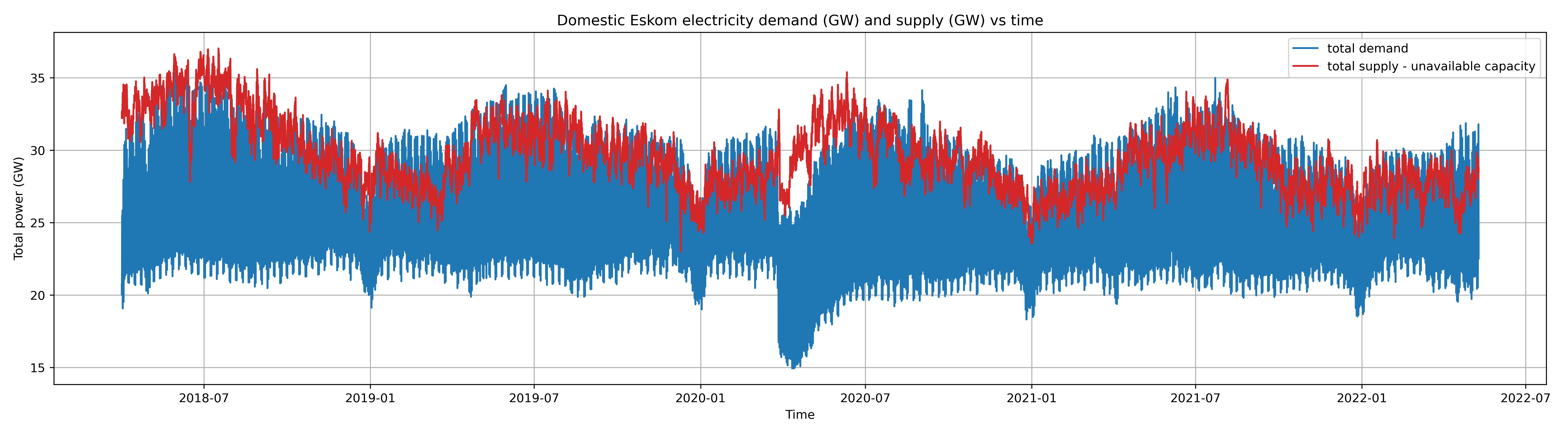
The figure warrants several important observations:
- As expected, Eskom can easily supply more than the minimum demand during off-peak hours (e.g. in the early mornings).
- When Eskom cannot supply demand (red curve goes below blue curve), it will either (a) turn on its emergency reserves, such as diesel or gas turbine generators, or (b) implement loadshedding, or (c) both if the emergency generation capacity is lower than the shortfall. Naturally Eskom being a state monopoly means that the private sector is more-or-less not allowed to fill the gap in the market.
- Eskom’s available capacity has been on a fairly clear downward trend in the past five years. Frankly, from the data provided by Eskom, it wishes it had the generation capacity it did in mid-2018.
- In 2022 in particular the trend looks very poor, with the supply (red line) almost consistently below the maximum of the demand (blue curve), hence the increase in loadshedding.
- The sudden drop in March 2020 is due to Cyril Ramaphosa’s executive order to ban the majority of economic activity in the country for 21 days, with slim exceptions for government-defined ‘essential services’. The stated reason for this ban on the majority of economic activity was to reduce the spread of COVID-19. And, since the majority of electricity demand is from industry (not residential customers), the massive reduction in economic activity from this ban caused a large drop in electricity demand. After 21 days Cyril Ramaphosa changed this ban to be less stringent and allow more economic activity, resulting in a low return of economic activities (and thus consumer electricity demand, as shown in graph during mid-2020).
With this in mind, we observe trend 2:
Trend 2: Local electricity demand has remained roughly stable or trended slightly downwards in the past 5 years, while the amount of electricity Eskom can supply has also trended downwards. So the cause for inflation (a general increase in the level of electricity prices / decrease in electricity purchasing power of the Rand) is not that local demand has risen, but rather that Eskom’s available supply has dropped.
3. Outages
The next question one might have is what is the cause of Eskom’s decreasing available generation capacity? Are they simply adding too few new generation units, or are the existing ones having far too many unplanned outages? Or is so-called planned maintenance taking up more and more of the generation capacity?
To answer this in part, in the plot below we show what Eskom calls the total UCLF (unplanned capacity loss factor), OCLF (other capacity loss factor), and PCLF (planned capacity loss factor). From a customer perspective, what these represent are:
- PCLF: planned maintenance of power plants. I.e. the current loss in generation capacity due to planned maintenance of existing power plants.
- UCLF: unplanned maintenance of power plants. I.e. unexpected or unplanned power plant breakdowns that require immediate or otherwise unscheduled maintenance.
- OCLF: all other sources of loss in generation. Examples include industrial strikes, bad quality coal, or supposedly any other aspect that is out of the power station management’s control.
Below we see each of these together with the total installed capacity Eskom has added since ~5 years ago (Apr 2018):
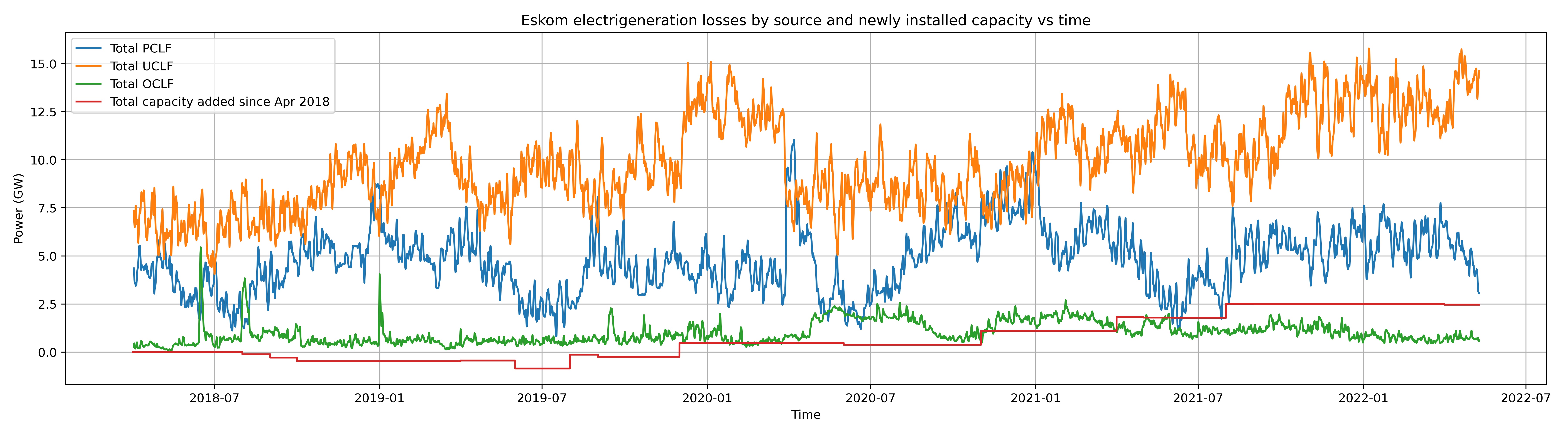
We can see the issue more clearly: a drastic increase in the amount of unplanned maintenance and other UCLF losses. They are installing additional capacity slowly, and planned maintenance or other outages are not rising significantly. So, this leads us to another trend:
Trend 3: Eskom has had an upward trend in the amount of generation capacity eaten up by unplanned maintenance. This increase in unplanned maintenance is far greater than additional installed capacity and dwarfs changes in losses due to planned maintenance and other losses.
Summary
Sticking with the rule of three, I will keep this post short and to the point: loadshedding is getting worse. Loadshedding is more frequent, the generation capacity of Eskom is decreasing, and all this data was scraped in late April 2022, before the recent massive increase in Stage 5 & 6 loadshedding this year, and we are only now entering July – the heaviest electricity demand month of each year (see the peaks in the demand graphs above – all in July).
Hopefully these quick graphs give you a glimpse of the state of South Africa’s government electricity monopoly and what it means for those subject to its whim. If I had Eskom’s internal financial documents and a good dataset of electricity prices, it would be even more illustrative to graph their trends and look into their relationships and how the cost to Eskom has changed versus how the cost to consumer (e.g. per kWh) has changed (accounting for inflation). Perhaps if such datasets should avail me in the future I will continue this analysis, however I suspect most people in South Africa could give an accurate analysis of the situation without being privy to the fine numerical details.
Thank you for reading to the end!
tags: Eskom - state monopoly - electricity - loadshedding