M Baas
I am a machine learning researcher at Camb.AI. I post about deep learning, electronics, and other things I find interesting.
Has the cost of living for the typical South African worker improved since 2000?
by Matthew Baas
This post aims to answer a simple, concrete question: has the cost of living for the average person in South Africa improved at all since 2000?
Economic data about inflation, CPI, GDP per capita, are all fundamentally abstractions with various external influences that make it difficult to get an intuitive and concrete understanding for the wealth of people over long periods of time. Using data provided by the South African government through StatsSA, as well as several private organizations, this post aims to get around comparing abstract indices and instead compare the cost of living for several common household goods expressed as the number of hours that an average person needs to work to afford each good.
I will be assuming you have a basic idea of what per-capita, mean, and median are for this post. For those with a long memory, the final conclusions of the data may seem obvious and this post may be of less use to you. But, unfortunately, many (myself included) were too young to have to deal with the daily cost of living 25 years ago (or not yet even born).
1. Motivation
Often I hear people make claims that life for the average South African was better or worse decades ago. While I may have an idea one way or another through macroeconomic changes (e.g. the non-existence of loadshedding many many years ago), it is only an indirect sign and isn’t concrete. One more direct piece of evidence is the cost of living: how much does it cost to maintain one’s standard of living on a day-to-day basis?
So, this post aims to perform one concrete comparison: to compare several components of the cost of living in 2000 vs 2023. Aside: why 2023 and not 2025? Because we have much more readily available data for 2023 than 2024/2025 as of Feb 2025.
The simplest way to compare the change in cost of living is to find the inflation of R1 in 2000 in 2025 using the Consumer Price Index (CPI), and then comparing that to the mean wage in 2000 and 2025. However, this has several problems:
- The calculation method for the CPI is set by the government, which has an incentive to measure inflation in a way that is more favorable to the current ruling party.
- CPI, real GDP-per-capita, and other macroeconomic measures are too abstract to be a meaningful number for most people to reason about. They also couple some effects while excluding others, such as (theoretically) including currency debasement but excluding changes in income distribution/equality.
- The mean wage doesn’t measure the typical worker’s income. Rather, it measures the average income earned. Meanwhile, the median wage does better reflect the typical worker’s income. If the top 10% of earners triple their income, ceteris paribus, it will not change the median, and therefore the median wage isn’t distorted by high levels of income inequality.
2. Method
Given the problems with the above, I design my comparison for cost of living in 2000 vs 2023 with the following:
- The median wage in 2000 and 2023 will be used to measure the typical South African’s income. These numbers will be obtained from StatsSA.
- The cost of living will be measured using several consumer products that have remained constant (measured/priced by the same people on products that are as similar as possible). Food data will be sourced from NAMC, an official source of agricultural prices for several decades. Prices for more expensive goods like a car will be obtained through present and historical quotes of the price of vehicles produced by the Kariega Volkswagen factory, since it has been operating in South Africa for a long time
- The cost of various items a typical worker might buy in his/her daily life will be expressed as a number of hours he/she’d have to work to buy 1 of that product. For example, if you earned the equivalent of R50/hour, and product X cost R25, that product costs 30 minutes of your time. This gets around all issues around comparing across time, since everyone has 24 hours (and 8 working hours) every day, whether in 1200, 2000, or 2023. There is precisely zero inflation for the amount of time we have every day.
3. Data
3.1 Income data
The surveys and data collections of StatsSA have changed over the decades, and the particular survey which contains worker income levels has also changed.
Concretely, for 2000, I obtain this data from the Labour Force Survey of March 2000, using the Income categories field.
The data is shown below:
Table 1: Number of people earning in each income bracket (SA Labour Force Survey, March 2000)
| Annual income | Number of responses | |
|---|---|---|
| 1 | R1 - R2 400 | 141860 |
| 2 | R2 401 - R6 000 | 201843 |
| 3 | R6 001 - R12 000 | 223856 |
| 4 | R12 001 - R18 000 | 258069 |
| 5 | R18 001 - R30 000 | 450130 |
| 6 | R30 001 - R42 000 | 306137 |
| 7 | R42 001 - R54 000 | 252348 |
| 8 | R54 001 - R72 000 | 257843 |
| 9 | R72 001 - R96 000 | 155018 |
| 10 | R96 001 - R132 000 | 93388 |
| 11 | R132 001 - R192 000 | 68765 |
| 12 | R192 001 - R360 000 | 45634 |
| 13 | R360 001+ | 17896 |
This survey changed in the late 2000s into the Quarterly Labour Force Survey in a different format which does not survey income levels. The equivalent data is obtained now from the General Household Survey 2023, using the Income categories field for the individual respondent (i.e. not the whole household data).
The data is shown below:
Table 2: Number of people earning in each income bracket (SA General Household Survey 2023)
| Annual income | Number of responses | |
|---|---|---|
| 1 | R1 - R2400 | 73730 |
| 2 | R2 401 - R6 000 | 136957 |
| 3 | R6 001 - R12 000 | 190792 |
| 4 | R12 001 - R18 000 | 223862 |
| 5 | R18 001 - R30 000 | 424534 |
| 6 | R30 001 - R42 000 | 564217 |
| 7 | R42 001 - R54 000 | 677917 |
| 8 | R54 001 - R72 000 | 748804 |
| 9 | R72 001 - R96 000 | 628692 |
| 10 | R96 001 - R132 000 | 594694 |
| 11 | R132 001 - R192 000 | 612027 |
| 12 | R192 001 - R360 000 | 1019004 |
| 13 | R360 001 - R450 000 | 267732 |
| 14 | R450 001 - R650 000 | 199470 |
| 15 | R650 001 - R750 000 | 68926 |
| 16 | R750 001 - R850 000 | 23927 |
| 17 | R850 001 - R1 000 000 | 49569 |
| 18 | R1 000 001 or more | 75124 |
Important notes:
- For our analysis, I am only including workers. That is, the surveys from both years also contain numbers of respondents for categories of
'Do not know', 'Refused to answer', 'Not applicable'. These seem to include both people who were unemployed or didn’t wish to answer. I am excluding these from the analysis, as our question is about the average worker (i.e. someone who is employed), not the average citizen (including both employed and unemployed people). - The StatsSA dataset portal doesn’t provide/allow for static links to these specific dataset columns, however they are all available to the public on their website here.
- These are nominal/raw income numbers, and are not adjusted for inflation. Again, the goal here is to compare directly in terms of number of minutes of work needed to buy various products in 2000 and 2023, and not get bogged down in the complexities of ensuring a fair comparison when using abstract macro-economic indicators like CPI.
3.2 Cost data
The second part of the analysis is to obtain the nominal price of goods in the year 2000 and 2023. This data is provided by NAMC here for the year 2000, and their equivalent report for 2023. Since link rot is a risk (and common archive services don’t work too well with PDFs), the key tables from both are reproduced below:
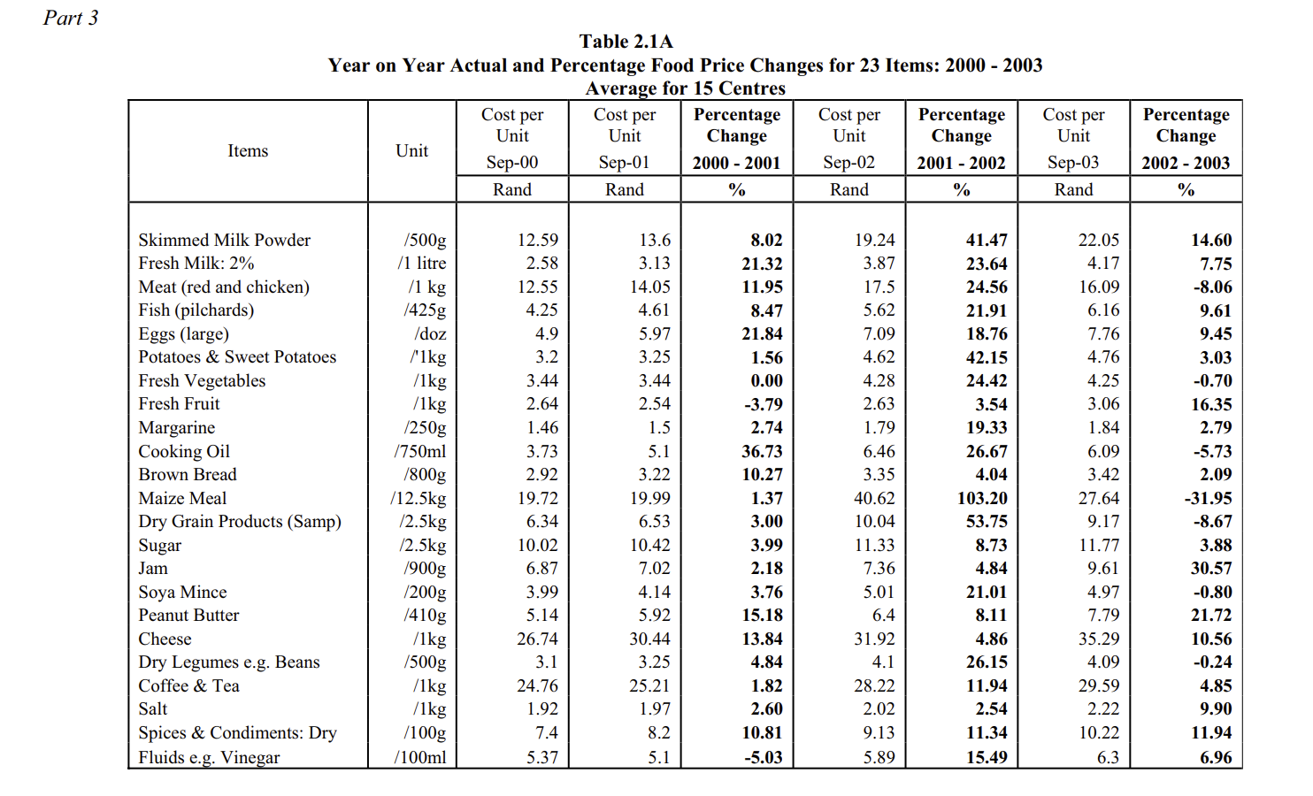
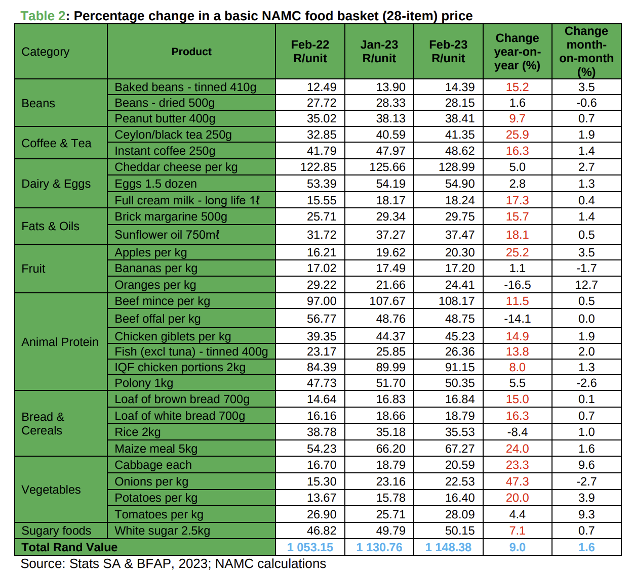
The key parts of this data I’ll look at are those entries where the products and their quantities have remained the same between 2000 and 2023. Some situations are harder to compare – in these cases I will always use the numbers which provides the most beneficial comparison to the present. For example, the 2000 year data only provides joint chicken/red meat pricing per kg, while 2023 provides a more specific breakdown. So, the most beneficial comparison will be to use the cheapest of the 2023’s prices (chicken giblets) to compare to average chicken and red meat pricing data of 2000, since red meat is more expensive than chicken.
Further, the above data provides prices for several months throughout the year. To be as close to 2023 years difference as possible, I’ll be using the February data from 2023 and September data from 2000, since it is the best I have. Finally, for a more expensive product to assess cost of living (even if most people do not directly buy new ones) is the price of an entry-level car produced in South Africa: the entry-level VW Polo.
Finding MSRP listing price for the VW Polo in 2000 and 2023 is much more tricky due to how bad search engine results have become, being entirely polluted with pricing info SEO slop from car dealerships for 2nd hand cars deals for old VW Polos. The best I could find was the listing price in 2002 at R102 450 for the cheapest entry-level car, and the latest 2025 pricing at R373 800. While not optimal, both offsets are in the same direction, so the effect should be minimized. i.e. instead of 2000 and 2023, it is 2002 and 2025, both shifted forwards by 2 years. So, the comparison should still be crudely valid, say within 10-20% error.
4. Analysis
With the data above, it is now possible to compute the real cost of these goods in terms of the number of minutes worked to afford each product. The calculation proceeds as follows:
-
Compute the median hourly wage in 2000 and 2023, assuming 40 working hours per week and 4 working weeks per month:
-
2000 median hourly wage: from Table 1, the median annual income bracket is R18 001 - R30 000. Next I make the assumption that the median income can be approximated as the middle of this income bracket, R24 000.50. This implies a median hourly wage of
R24 000.50/(12*40*4) = R12.50. -
2023 median hourly wage: Similarly from Table 2, the median annual income bracket is R54 001-R72 000, approximated to R63 000.50. This implies a median hourly wage of
R63 000.50/(12*40*4) = R32.81.
Note that the denominator corresponding to total working hours per year is approximate and does not affect our final conclusions, only the relative numbers. E.g. if December was excluded to account for holidays, the /12… would simply become /11. Both numbers would be adjusted by the same ratio, and all comparisons would yield the same answers. In other words: the fact that the number of working hours per year used here is approximate does not change any conclusions from the data.
The astute readers will already see bad news here – given public CPI numbers, R1 in 2000 should be around R3.4 in 2023, or a 3.4x increase. But, the median wage has only increased by a factor of 2.62x (R63k/R24k).
-
-
Express the cost of equivalent goods in 2000 and 2023 as a number of working hours (of the median worker) to afford each product. For example, 2.5kg of sugar cost R10.02 in 2000. As a number of working minutes for the median worker, it is
60 minutes * (10.02/12.50) = 48 minutes. This means that the median South African worker in 2000 will need to work for 48 minutes to afford 2.5kg of sugar in the shops. Performing the same computation for several common goods between the past and now yields our main results:
Table 3: real price of goods in South Africa in 2000 and 2023, expressed in working minutes of the median wage earner
| Product | 2000 price for median wage earner | 2023 price for median wage earner | Notes |
|---|---|---|---|
| Sugar | 48.1 min | 91.7 min | 2.5kg bag |
| Cheese | 2 hr 8.4 min | 3 hr 55.7 min | 1kg cheddar |
| Beans | 14.9 min | 51.5 min | Dry, 500g |
| Cooking oil | 17.9 min | 68.5 min | 750ml |
| Milk | 12.4 min | 33.35 min | Full-fat, 1L |
| Potatoes | 15.4 min | 25.0 min | 1kg |
| Fish | 20.4 min | 48.2 min | 425g in 2000, 400g in 2023. Canned, excl. tuna |
| Fruit | 12.7 min | 31.5 min | 1kg, mixed bag in 2000, cheapest (bananas) in 2023 |
| Peanut butter | 24.7 min | 70.2 min | 410g in 2000, 400g in 2023 |
| Brown bread | 14.0 min | 30.8 min | 800g in 2000, 700g in 2023 |
| Maize meal | 1 hr 34.5 min | 2 hr 1 min | 12.5kg bag in 2000, 5kg bag in 2023 |
| Meat | 1 hr 0.2 min | 1 hr 22.7 min | 1kg mixed chicken and red meat in 2000, 1kg chicken only in 2023 |
| VW Polo hatchback | 51.2 months* | 71.2 months* | *the 2000 column price is that of a new 1.4L Polo in 2002, the 2023 column price is that of a new 1.0L Polo in 2025, due to data limitations. |
4.1 Observations
The first thing one observes from the data is that, without exception, everything is more expensive in 2023 than in 2000. All goods considered require the average South African worker to spend more time working before they can afford the product. Some of the examples are stark:
- In 2000, the median worker had to work for 12.4 minutes to afford 1L of milk in the shops. In 2023, the same median worker must work for 33.35 minutes for the same product.
- In 2000, for the median worker, an hour’s wages bought 1kg of chicken and red meat. In 2023, 1kg of only chicken now costs 1 hour 20 minutes’ wages.
- In 2000, for the median worker, 1kg of potatoes costs 15 minutes’ wages. In 2023, it now costs 25 minutes’ wages.
- A brand new VW Polo went from a dream purchase to maybe save up over the lifetime for the average worker (costing 4.2 years’ wages), to a near unobtainable distant dream (~6 years’ wages).
Further, another trend observed in the data is that there is clearly some shrinkflation to mask the effects of increasing costs: standard 410g peanut butter in 2000 became 400g in 2023; 800g brown bread became 700g brown bread; 425g fish became 400g fish. Despite the decrease in size, the prices always still increase more than wages.
From the data, it is clear that just about everything has become more expensive for the median worker. Since everyone must still live and only has a fixed number of working hours in a day, this means that their cost of living has increased, and their quality of life has dropped as they have to ration their fixed time among more scarce resources.
The conclusion from this data is clear:
Conclusions:
- For all goods considered, the median South African worker must work longer hours in 2023 to afford the same products the median worker could afford in 2000.
- The cost of living for the median South African worker has not improved between 2000 and 2023. In fact, it has markedly increased since 2000, with most goods costing more of worker’s wages than in the past.
- Certain luxury goods have become increasingly impossible to afford, and wage increases for the average South African worker have been substantially below the level of price increases between 2000 and 2023.
While many have speculations as to why this might be the case, and who is responsible, for this post I will restrict purely to the price/wage data collation and analysis part of the question. One key thing I wished to demonstrate with this analysis, is that we can make the economic data extremely practical and remove the inaccuracies obtained with macro-economic abstractions like CPI, GDP-per-capita etc… Expressing the price of locally produced goods as the number of working hours’ wages for the median worker gets around many of the pitfalls when comparing economic statistics. It has the key benefits of not being distorted by highly unequal income distributions, inaccurate inflation/currency debasement numbers, turbulent currency exchange ratios, or other factors which, frankly, the median worker doesn’t think about. They likely think about how much a good costs when they’re doing their shopping, at that instant, and how much of their wages goes towards filling their shopping basket.
I highly encourage interested readers to look into some of the old data available by certain South African publications like NAMC, StatsSA, SARB, etc. They contain rich datasets that are poorly indexed by search engines and some of them go back many years.
5. Summary
Overall this mini data analysis project was a more sobering exercise than had been anticipated. My memory of the daily finances back in the early 2000s is not great since I was still a toddler, so I didn’t quite know what to expect when starting the analysis. But, seeing how severely the cost of everyday items for the average worker has gone up way beyond any wage increases has been…
Another interesting note about the analysis is that I excluded the unemployed / those who didn’t report a wage income in the analysis. If I included those earning zero income (or those receiving taxpayer money through the welfare state), then the results would have been even more drastic seeing as unemployment in 2023 was around 32%, while back in 2000 it was closer to 25%.
I hope you found this post valuable, and that it might encourage you to dig a bit into the data provided by our public bodies, looking beyond headline aggregate macroeconomic abstractions to get a more accurate picture of reality. If you spot any inaccuracies in my analysis, or typos / other mistakes, please let me know via the About page and I will be happy to rectify them. And, if you want to be notified of new posts, feel free sign up to my notification list: mbaas.substack.com .
As always, thanks for reading!
tags: economics - analysis - south africa